A vendor whitepaper and a Slack screenshot from a trusted colleague can score the same 'average quality' - but betting a decision on one vs the other is a different risk entirely. I break down R_eff: three axes of evidence, the weakest-link rule, context matching - and why one benchmark you ran yourself beats ten blog posts from strangers.
The familiar situation: two sources, one average
Monday morning. The product manager calls a meeting: we’re choosing a bank integration provider. Two candidates are on the table. Each comes with two sets of materials.
The first - an official whitepaper. A forty-page PDF, charts, customer case studies, throughput figures, a promise of “99.99% average uptime over the past year.” Perfectly formatted. Organized into five sections with subheadings.
The second - a screenshot from a chat with a tech director you know, who worked with this provider for six months. Three paragraphs: “holds fine on our load, p95 latency 180ms, last time it went down was second week of January, took seven hours to fix.” No charts. No colored callout boxes.
The team starts discussing, and someone says: “The whitepaper looks stronger. Let’s go with that.”
I want to break down why this reflex is the most common mistake in vendor selection, and what simple logic stops it. No new tools, no “data culture” transformation. One way to assess trust in a source that you can try on your next decision.
Three axes that are actually not one
When we say “high-quality source” we’re conflating three different things, each of which is independent of the others.
The first is formality of specification. How precisely the source defines what it’s measuring and under what conditions. Whitepapers are usually strong here: five pages on methodology, breakdown by scenario, description of the test environment. A Slack message from a colleague is weaker: “holds fine on our load” leaves open what “our load” actually means. I’ll call this axis F (formal).
The second is granularity of data. How much the source relies on concrete observations rather than general statements. “99.99% uptime” is a number. “p95 latency 180ms” is a number. Both sources can be strong on this axis simultaneously. I’ll call it G (granular).
The third is reliability relative to your context. The whitepaper is produced by a company selling a product - they have motivation to show the upside and suppress the downside. The message from a colleague who has no reason to sell or flatter is stronger on this axis. I’ll call it R (reliable).
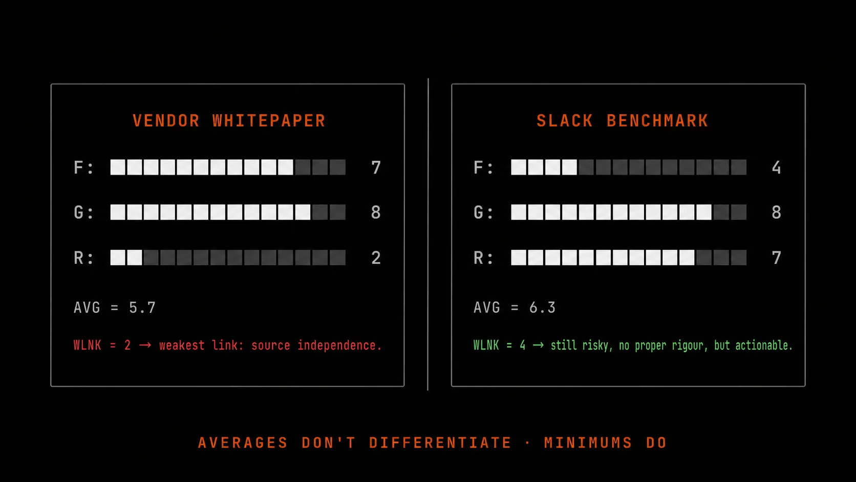
You can think of these three axes as coordinates in three-dimensional space. The whitepaper: F=8, G=7, R=2 (seller’s motivation). The Slack message: F=4, G=7, R=8 (no motivation to exaggerate).
If you average them, both sources score around 5.5 - nearly identical. But if you apply a different evaluation logic, the picture reverses.
Why the axes are independent
The most important thing to understand: these three axes aren’t gradations of one quality. They describe different classes of failure, and a strength on one axis does not compensate for a weakness on another.
A source can be extremely precise in its specification but rely on outdated data - and then the precision doesn’t save you. A source can be detailed down to decimal points, but come from a vendor with motivation to flatter - and then the detail works against you (you’ll believe the specifics without asking where they came from). A source can come from a completely trustworthy colleague, but be phrased so vaguely that you draw the wrong conclusion from it.
This is like evaluating a car at purchase. One has a great engine but worn-out brakes. The other has new brakes but a rusted body. Averaging gives you “both are fine,” but driving them is a different risk profile. And not every risk can be offset by a strength somewhere else.
In practice, teams most often fail on the R axis, because it’s the most uncomfortable to probe. Asking “how neutral is this source” is essentially questioning the professionalism of the author. So most discussions collapse into evaluating F and G, while R is silently assumed to be “average.”
The weakest-link rule
Since the axes are independent, the meaningful assessment is the minimum, not the average. Trust in a source is capped by its weakest link, not its strongest.
Whitepaper: F=8, G=7, R=2. Trust = 2 out of 9. Slack message: F=4, G=7, R=8. Trust = 4 out of 9.
By this logic the Slack message is twice as trustworthy, even though its average is lower.
The car inspection analogy helps make this stick. At a vehicle inspection station, they check brakes, steering, lights, tires. If any single item fails - the car doesn’t get road clearance, no matter how good everything else is. Nobody computes “average car quality” - because failure in one critical subsystem kills the whole trip.
Evidence for a decision works the same way. If even one of the three axes is a failure, trust in that source is low - regardless of how strong the others are. This is counterintuitive for teams used to averaging, but it’s exactly this logic that protects against the typical mistake of “leaning on well-formatted but one-sided material.”
Context matching level
Beyond the three axes there’s a fourth dimension: how applicable the source is to your specific situation.
Your own measurement on your own project, with your own load, in your own environment - highest level. No assumptions about transferability needed. I’ll call this CL3 (context level 3).
A measurement from a similar project in similar conditions - nearly the highest. One assumption: your project is close enough in character. CL2.
Vendor documentation describing a “typical scenario” - lower. Assumption: your scenario matches what they mean by “typical.” CL1.
A Stack Overflow answer about a different language that looks vaguely like your case - almost worthless. Too many assumptions. CL0.
Each step down is a penalty on the final score. A source can be strong on F/G/R, but if its context match is low, the resulting trust drops proportionally. This is the second defense against “saw a beautiful benchmark, hoped it would apply to us.”
The formula in one line
Let’s put it all together. Trust in a decision is the minimum across all pieces of evidence, adjusted for context-matching penalty.
Don’t be intimidated - the math fits in one line: R_eff = min(evidence scores) × (1 − CL penalty).
Penalties by level: CL3 = 0 (no penalty), CL2 = 0.1 (minus 10%), CL1 = 0.4 (minus 40%), CL0 = 0.9 (minus 90% - effectively zeroes it out).
Take an example. A team is choosing between two search engines. Three sources:
- Their own benchmark on 1,000 notes (F=5, G=8, R=7) - CL2 (not on the full dataset)
- Documentation from one of the engines (F=8, G=6, R=4) - CL1 (their typical scenario, not ours)
- A Hacker News post: “ours broke in production” (F=2, G=7, R=6) - CL1
By average: around 5.7. The team looks and thinks “that’s fine, we can lean on this.”
By R_eff: minimum of the first source = 5 (CL2 penalty 10% → 4.5), minimum of the second = 4 (CL1 penalty 40% → 2.4), minimum of the third = 2 (CL1 penalty 40% → 1.2). Overall minimum - 1.2 out of 9. AT RISK - the decision rests on one under-verified warning and two weak supports.
The team sees this and understands: they need one more strong source - for example, their own benchmark on the full dataset (CL3, R_eff will jump several-fold). A day and a half of work, and trust reaches a reasonable level. Without it - three months after launch you’ll realize you picked an engine that can’t handle your load, and rewriting takes two sprints.
Concrete example: specialized store vs. universal database
Let me tell one case, details changed.
A team building a local note-taking app is choosing a vector store for semantic search. Two candidates: a specialized columnar store for vectors, and a general-purpose database with one of its available vector extensions.
Three sources assembled:
- Own benchmark on 1,000 notes: specialized - p95 60ms, universal with extension - p95 90ms (F=6, G=8, R=8, CL2 - not on the full 50,000)
- Blog post from the specialized store’s vendor on performance at one million vectors (F=7, G=8, R=3 - marketing material, CL1)
- Hacker News post: “ours broke on version upgrade” with no reproducible scenario (F=3, G=4, R=6, CL1)
By average - the specialized option looks “fine.” By R_eff: first source - 6 × 0.9 = 5.4 (minus 10% for CL2). Second - 3 × 0.6 = 1.8. Third - 3 × 0.6 = 1.8. Minimum - 1.8.
The team sees that trust is being held down by the weakest piece - the unexplained Hacker News breakage is dragging the whole decision down. They go find a fourth source: reproduce the upgrade scenario from that post, test it against their own data. An hour of work. It turns out the issue was fixed in a later version. The source gets reclassified: “outdated, fixed in version X.Y.” It can be excluded.
New R_eff = min(5.4, 1.8) = 1.8 - still weak. The team adds their own benchmark on the full 50,000 notes. Gets p95 75ms - also within requirements. CL3, F=7, G=9, R=8 - no penalty, score 7. New R_eff = min(5.4, 1.8, 7) = 1.8.
And here the team notices something important: the second source (the marketing blog) is still pulling the score down. The decision can be made, but with an explicit note: “we’re relying on our own benchmark; the vendor’s marketing material is not counted as evidence.” That note goes into the decision record (a format I’ll cover in the next post) so a year from now nobody thinks the decision was made because of the vendor’s pretty charts.
This is an example of how one simple logic shift - minimum instead of average - changes the quality of the discussion. Instead of “everything looks OK, let’s go” - “the weak link is here, let’s shore it up or explicitly acknowledge it.”
What to hand to the AI agent, what to keep for yourself
An AI agent (Claude Code, Cursor, any coding assistant) handles the first step well: gather sources on a topic, list them in a table with scores on all three axes, and suggest a context level for each. In five minutes it gives you a draft that a human would spend an hour on.
The final step - assigning the R score (reliability relative to your context) - is worth keeping for yourself. The agent doesn’t know that the company who wrote the whitepaper recently tried to sell you a subscription and got turned down. Doesn’t know that the tech director from the Slack message last year recommended a library that broke for you six months later. These details are internal team context that will never appear in public sources. Only a human can cross-reference them.
Basic rule: the agent gathers and scores on F/G, the human adds R and CL. If the agent assigns all four axes on its own - you don’t have a reliability assessment, you have a polished appearance of one.
What to read next
This is the third post in a series of eight on the discipline of making architectural decisions. Previous posts:
- The decision graveyard - why six months later nobody remembers the rationale
- Before you fix it, write three versions of the cause - the detective’s diagnostic technique
Next I’ll cover:
- What a decision record format looks like so it reopens itself a year later without the team having to remember anything.
- How a single chat message turns into a product document with 13 sections without scope-creep monstering.
This post is paired with an interactive walkthrough: a 3D scene in F/G/R space where you can rotate seven pieces of evidence and see how the minimum across axes differs from the average. It lives at /guides - spin it with your mouse, nothing to install.